Your walls are begging for personality, but your square footage is giving “nope.” Good news: small spaces are actually perfect for bold, creative art moments. You just need smart strategies that make your space feel curated, not cluttered. Ready to make your place look intentionally chic (and, yes, bigger)? Let’s do this.
1. Scale Like a Stylist: Big, Small, and Just-Right Proportions
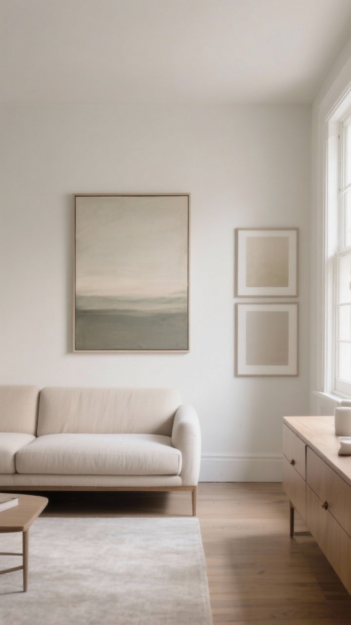
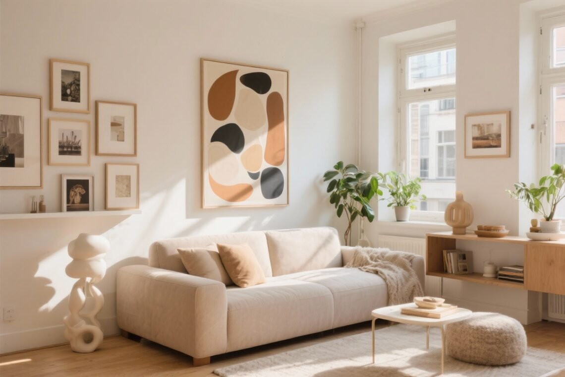
Here’s the tea: small spaces can totally handle big art. In fact, one substantial piece can feel cleaner than a bunch of tiny frames fighting for attention. A large canvas or oversized photo anchors the room and instantly looks elevated.
But size isn’t one-size-fits-all. The trick is to match the art to your “visual real estate.” Above a sofa? Aim for 60–75% of the sofa’s width. Over a dresser? Keep the art narrower than the furniture to maintain balance.
Quick tips:
- Go large: One statement piece over the bed or sofa keeps the room focused and calm.
- Try diptychs/triptychs: Split one visual into two or three panels for impact without bulk.
- Leave breathing room: Give at least 6–8 inches from furniture tops to the bottom of the frame.
2. Vertical Wins: Use Height, Not Floor Space
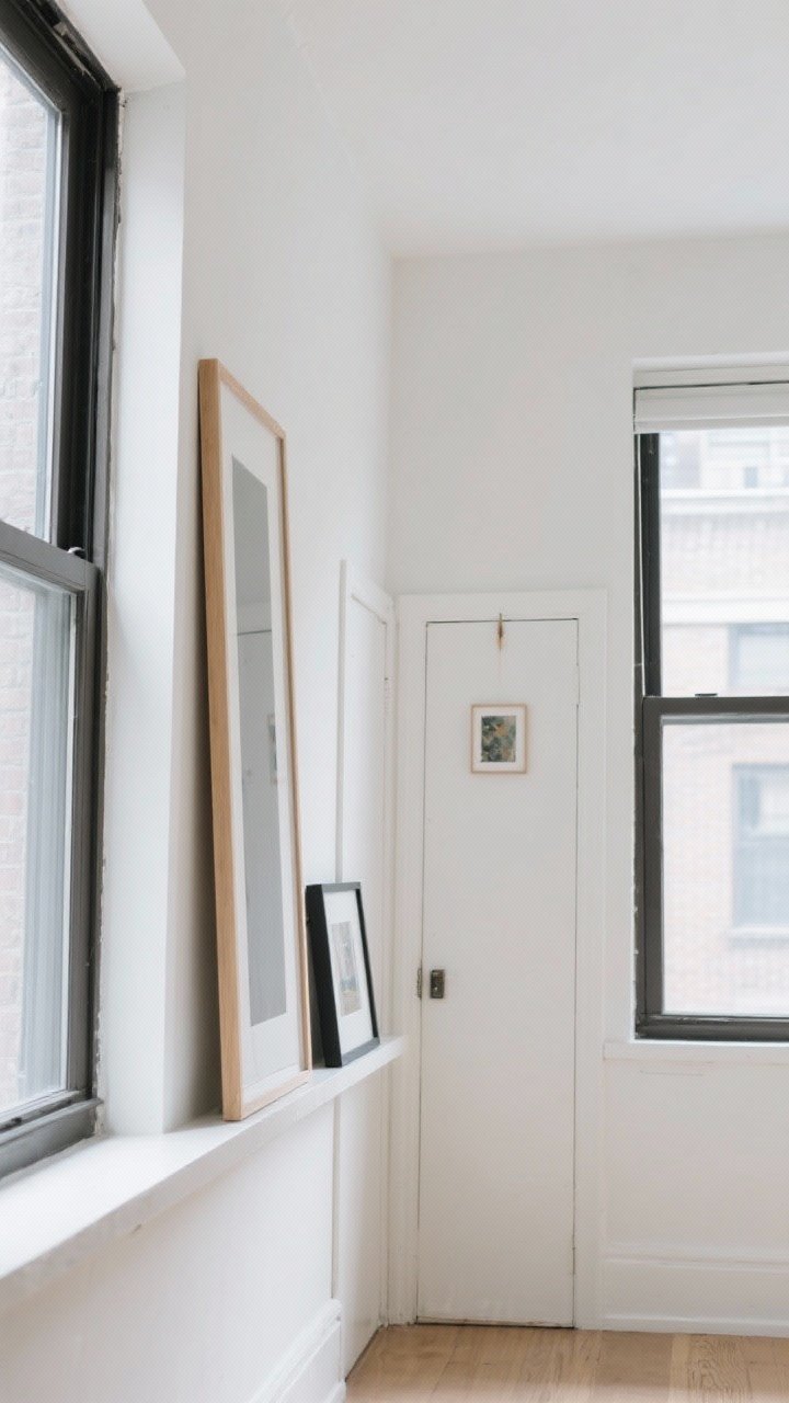
When in doubt, think up. Tall formats draw the eye, lift the vibe, and make ceilings feel higher. It’s basically visual Pilates for your room.
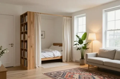
Leaning art stacks are clutch in tight quarters. Layer a tall frame behind a smaller one on a console or dresser for depth without drilling 12 holes.
Try these vertical moves:
- Skinny, tall frames: Perfect for awkward corners or between windows.
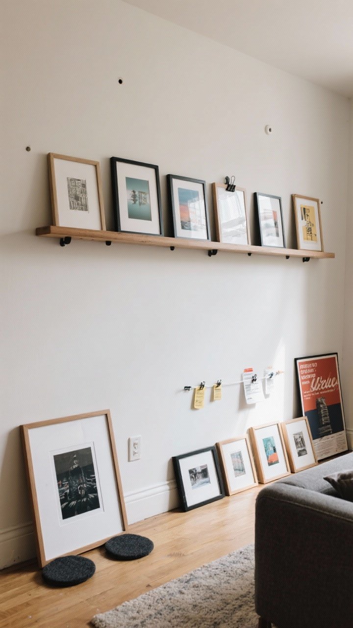
- Picture ledges: Mount a slim ledge and rotate art and objects without rehanging. FYI: 2–3 ledges stacked = mini gallery wall.
- Over-door art: Hang a small piece above a door or window for an unexpected moment.
3. Gallery Walls, But Make Them Chic (Not Chaotic)
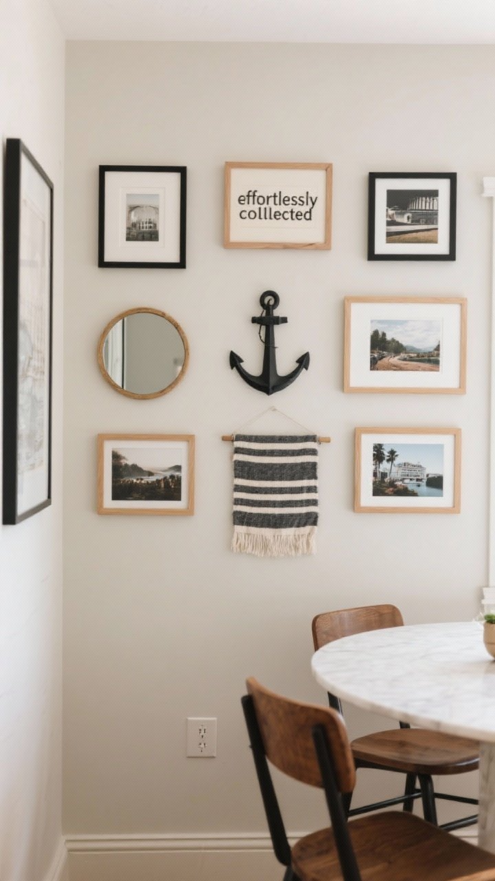
Gallery walls can be magic—or mayhem. The secret sauce is cohesion. Pick a theme that ties it all together: matching frames, a color story, or a consistent subject (botanicals, line drawings, travel photos).
Lay everything out on the floor first. Start with your anchor piece and build around it like a puzzle—balanced but not too perfect. The goal is “effortlessly collected,” not “I nailed random things to a wall.”
Rules that keep it classy
- Even spacing: Keep gaps consistent (2–3 inches is the sweet spot).
- Lower than you think: Center your main row around 57–60 inches from the floor—gallery standard.
- Mix mediums: Add a textile, a small mirror, or a sculptural piece so it’s not all flat paper.
- Limit the palette: Choose 2–3 frame finishes max to avoid visual noise.
4. Functional Art: Double Duty Or Bust
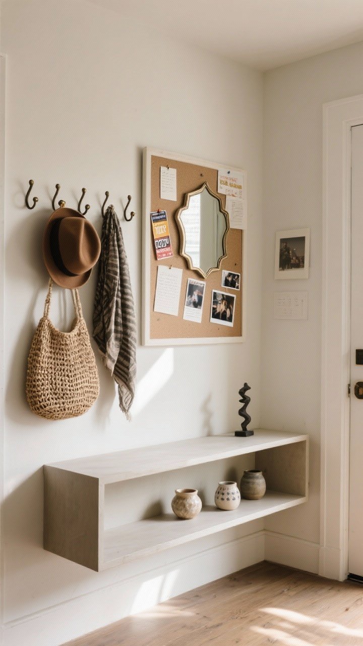
Small space? Make your art work. Literally. Choose pieces that look amazing and earn their keep. You get style points and storage without adding clutter. Win-win.
Think beyond paper and canvas—this is where everyday objects become statements.
Ideas that pull their weight:
- Decorative hooks/pegs: Hang your prettiest hats, bags, or scarves in an artful arrangement.
- Framed cork or linen boards: Pin photos, concert stubs, and notes for a rotating, personal gallery.
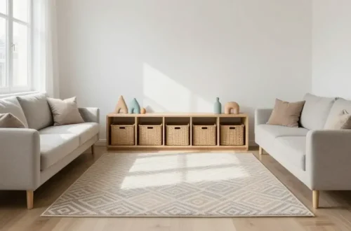
- Wall-mounted shelves: Display ceramics or small sculptures like a mini museum, while storing essentials.
- Artful mirrors: They bounce light and visually expand the room. Go vintage or geometric for personality.
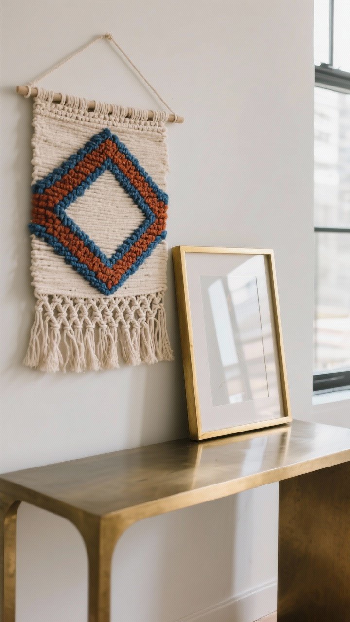
5. Color, Texture, And Light: Layer For Depth Without Bulk
Small spaces don’t need more stuff—they need more dimension. Use art to layer color, texture, and light so your walls feel alive without crowding the room.
Bonus: these tricks play well with neutral decor. Add one bright or textural piece and boom—instant personality.
How to layer like a pro
- Textile art: Hang a small kilim, macramé, or fabric piece for softness and warmth.
- Metallic frames or accents: Little bits of brass or chrome reflect light, making the space feel airier.
- Limited palette + one pop: Choose art that repeats 2–3 room colors, then introduce one bold accent.
- Glare check: If you’ve got tons of natural light, opt for matte or non-glare acrylic to keep reflections in check.
6. Style Without The Holes: Rental- and Commitment-Friendly Tricks
No drill? No problem. You can mount plenty with removable strips, easel stands, or clever leaning. IMO, leaning art gives that cool gallery vibe with zero risk to your deposit.
Also, rotating art keeps your space fresh and your walls happy. Seasonal swap? Artist print sale? Bring it on.
Damage-free options:
- Command strips and hooks: Great for frames up to their weight limit—check the label, seriously.
- Picture ledges and rail systems: Only a few holes, tons of flexibility.
- Leaning art: On mantels, consoles, and even the floor (large frames only, and add felt pads).
- Clip frames or poster rails: Lightweight, modern, and easy to switch out prints.
7. Curate Like A Collector: Make It Personal (And Cohesive)
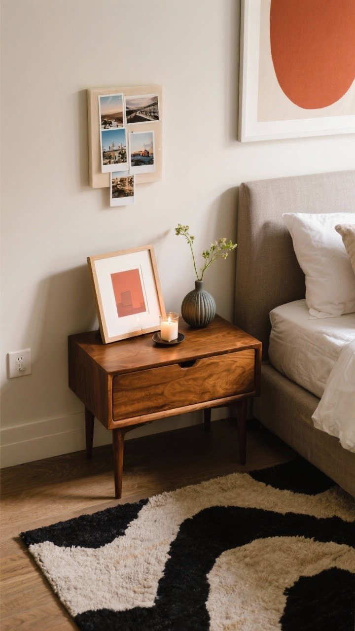
The best small-space art feels like you. Not a catalog. Mix high and low—originals, prints, thrift-store finds, family photos. If you love it, it belongs.
To keep everything cohesive, repeat an element across the room: a color, frame tone, or theme. That repetition silently says, “Yes, I meant to do that.”
Smart curation habits
- Create micro-vignettes: Pair a small frame with a candle and a bud vase on a nightstand. Tiny, stylish moment = big impact.
- Tell a story: Group art by mood or era—travel photos together, botanical prints together.
- Use scale echoes: If your rug has large shapes, try a bold, simple print to match the energy.
- Rotate seasonally: Swap a couple pieces every few months. Keeps things fresh without buying everything new, FYI.
Final pep talk: Small spaces aren’t a limit—they’re a creative prompt. Choose scale thoughtfully, go vertical, mix mediums, and let your art do double duty. Keep it personal, keep it balanced, and don’t be afraid of a bold moment. Your walls are ready for their close-up.