You’ve got an open floor plan—amazing for parties, not so amazing when your living room, dining area, and “work-from-couch” zone blur into one beige blob. Good news: color is your secret weapon. With a few clever paint choices, textiles, and accents, you can carve out gorgeous, functional zones without building a single wall.
1. Pick A Cohesive Palette (Then Assign Roles)

Before you start splashing paint, build a cohesive color palette that ties the whole space together. Choose one dominant neutral, two main colors, and one or two accents. Think of it like a cast of characters: each color gets a role in a different zone.
How To Build Your Palette
- Start with the constant: Your walls, trim, or large furniture should share a base neutral (soft white, warm greige, or muted stone).
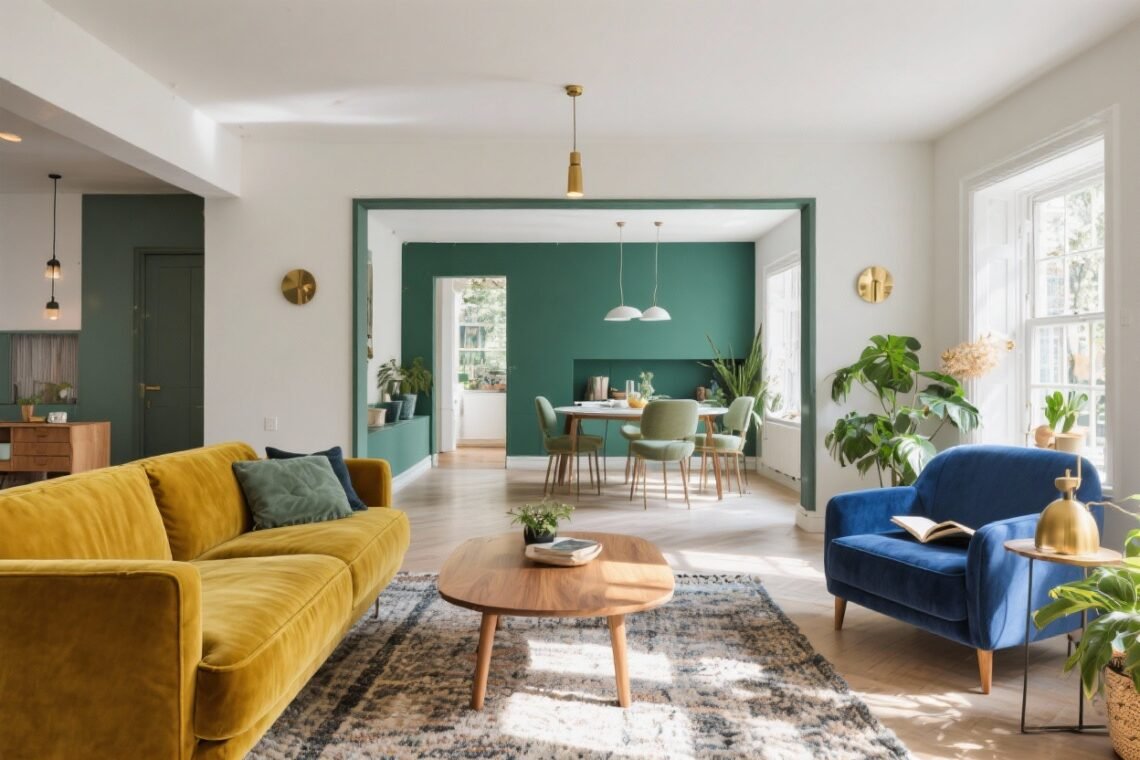
- Pick two “zone” colors: One could define the living area (e.g., forest green), the other the dining zone (e.g., spicy terracotta).
- Add accents: A pop like indigo or brass ties it all together without chaos.
FYI, this palette is your map. Once you’ve got it, every rug, pillow, and paint decision becomes easier—and way less risky.
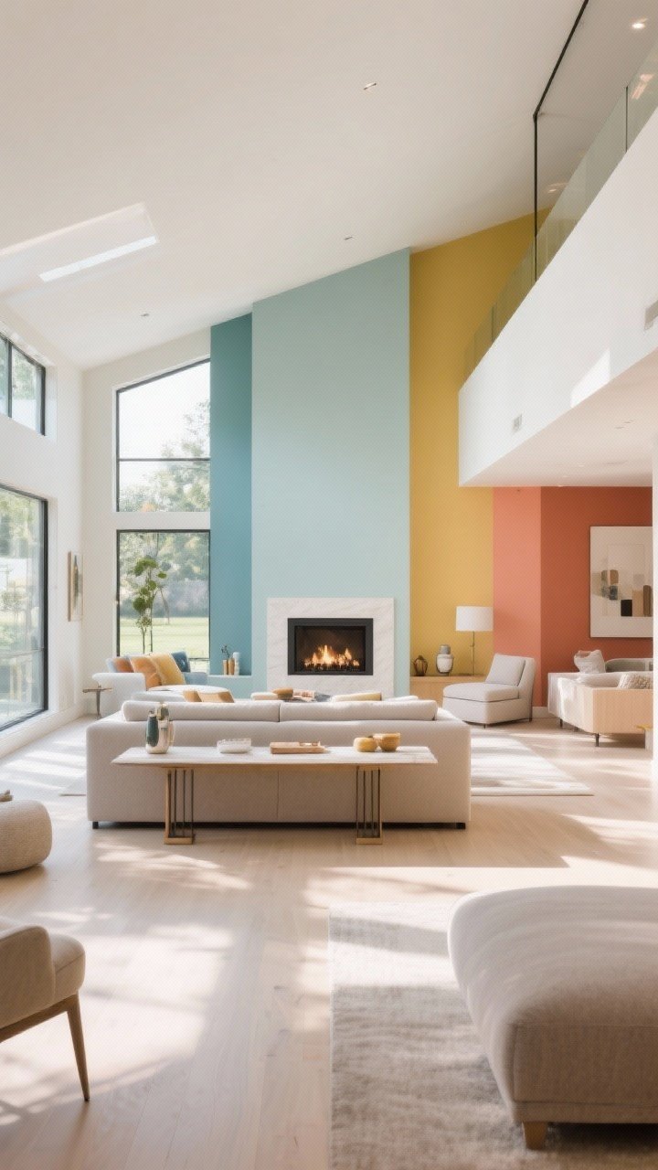
2. Use Paint To “Draw” Boundaries (Without Building Walls)
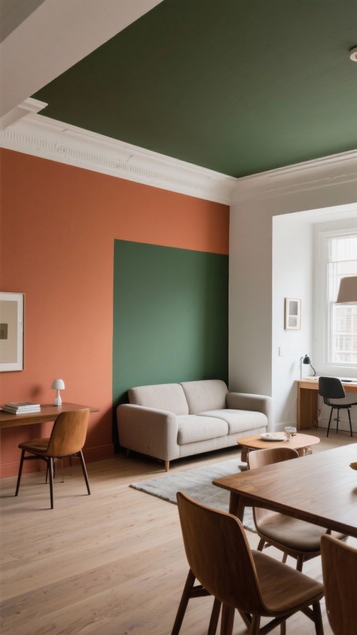
Paint is basically architecture in liquid form. You can visually partition spaces with clever paint tricks that feel intentional, not choppy.
Paint Tricks That Zone Like Magic
- Accent walls: Give your dining wall a warm terracotta to mark it off from the living area’s softer tones.
- Color blocking: Paint a rectangle behind the sofa to create a “backdrop” for the living zone.
- Half-painted walls: A two-tone wall (darker bottom, lighter top) in a workspace instantly says “office vibes.”
- Ceiling color: Paint the ceiling over your dining area a shade deeper to create a cozy “canopy.”
Pro tip: Keep trim consistent throughout to maintain flow. That way, zones are distinct but still part of one chic ecosystem.
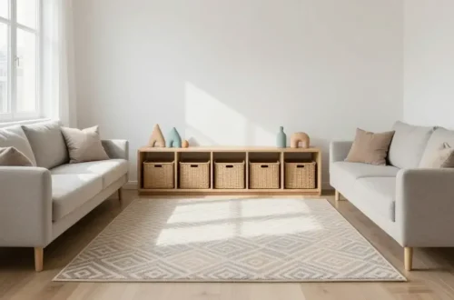
3. Anchor Each Zone With Rugs And Textiles
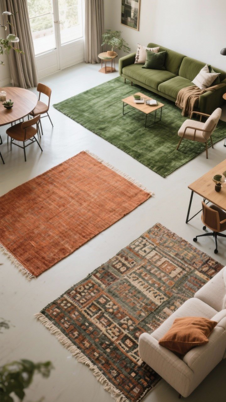
Rugs are the easiest way to anchor zones—and they do a lot of heavy lifting, visually and acoustically. Match each rug to its zone color so everything feels intentional, not accidental.
Textile Strategy That Works
- Living room: A large rug with your primary zone color under the sofa and chairs to define seating.
- Dining area: A flatweave rug in a complementary color that can handle crumbs and chairs sliding around.
- Workspace: A smaller patterned rug to signal focus (and hide coffee “oops”).
Echo the rug’s color with pillows, throws, and curtains in that same zone. It’s like giving each area a uniform, but make it cute.
4. Style With Gradients And Tones (Not Just Crayola Blocks)
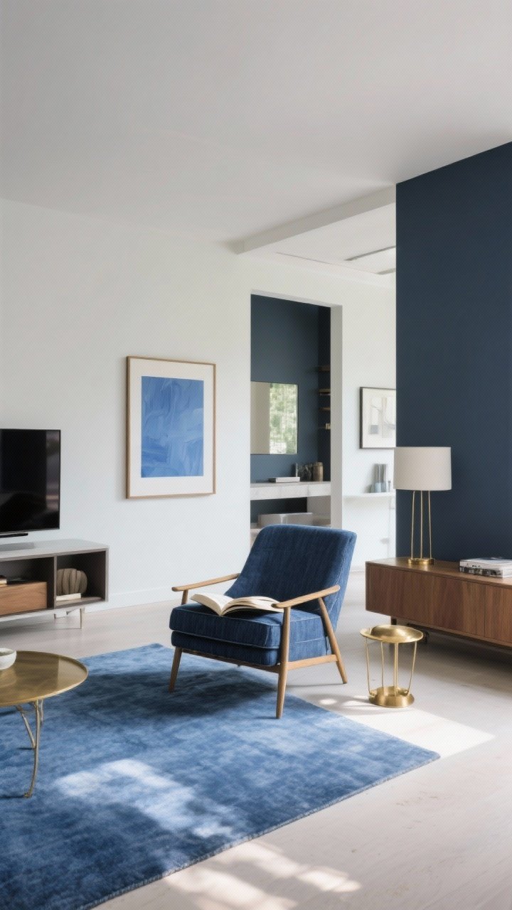
Zones shouldn’t feel like a patchwork quilt. Keep the flow by working with tones, tints, and shades of your palette instead of totally different colors. Think of it as color diplomacy—everyone gets along.
Gradient Moves
- Monochrome moments: Create a calm reading nook with varying blues—navy chair, denim rug, sky-blue art.
- Shared accent color: Use a common accent, like brass or black, in every zone for unity.
- From dark to light: Place deeper tones in a cozy area (TV zone) and lighter tones in high-traffic areas for airiness.
IMO, this is where spaces start feeling designer-level. It looks curated, not chaotic.
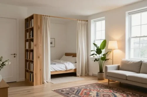
5. Define Zones With Art, Lighting, And Colorful Furniture
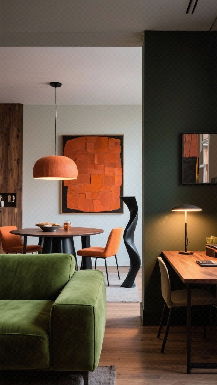
You don’t need to commit to full-wall color to make zones obvious. Let art, lamps, and furniture finishes carry color and set boundaries.
Smart Styling Moves
- Art scale and color: Hang a bold, large piece in the dining area with your dining color. Smaller gallery in the living zone with its palette.
- Lighting “bubbles”: A statement pendant over the table, a floor lamp by the sofa, and a task lamp at the desk—each in finishes that match the zone’s color story.
- Color-forward furniture: A moss-green sofa says “living room starts here,” while terracotta dining chairs define mealtime.
Bonus: Repeat materials—like matte black metal or warm oak—across zones to keep things cohesive even when colors change.
6. Make Color Work With Layout (Flow First, Then Flair)
Color is powerful, but it can’t fix a chaotic furniture plan. Your layout should support traffic, views, and function—then color enhances it.
Layout + Color Tips
- Orient around focal points: If the fireplace or a big window is the star, let the living zone face it; use color to frame, not fight, the view.
- Clear pathways: Use lighter colors along traffic lanes so walkways feel open and obvious.
- Back-of-sofa trick: Place a console table behind the sofa and style it with decor in the living zone’s palette—instant boundary.
- Repeat color at “edges”: Where zones meet, echo both colors in small accessories to soften the handoff.
It’s like traffic control, but stylish. No color pileups, please.
7. Test, Tweak, And Keep It Real-Life Friendly

Here’s the unsexy truth: you need to test colors in your actual light. Swatches look different at 8 a.m. vs. 8 p.m., and nobody wants a surprise neon effect at dinner.
Real-World Testing
- Paint big swatches: At least 2×2 feet on different walls. Live with them for a week.
- Check undertones: That “warm gray” might go purple with your bulbs. Test with warm and cool lighting.
- Durable finishes: Use scrubbable paint in kitchens/dining; stain-resistant fabrics in high-use zones.
- Scale your saturation: Go bolder where you want energy (dining, entry), softer where you want calm (living, bedroom zones).
FYI: You don’t have to commit to every wall. Sometimes adding color through textiles and art is enough—and easier to swap when your mood inevitably changes.
Wrap-Up: Open spaces don’t have to feel like a confusing airport terminal. With a cohesive palette, smart paint moves, and color-savvy styling, you can carve out zones that look intentional and live beautifully. Start small, trust your eye, and let your colors do the heavy lifting. You’ve got this—now go make those zones work for you.